Published: March 2020 | Last Updated:November 2025
© Copyright 2026, Reddog Consulting Group.

Improving your ecommerce conversion rate isn’t a dark art—it’s a science. The process involves methodically understanding what motivates your customers and removing any friction that stands in their way. This means looking beyond the final sale to analyze micro-conversions like add-to-cart rates and checkout completions to see exactly where shoppers drop off. The goal is to make smart, data-backed adjustments that lead to measurable revenue growth.
Before you start A/B testing button colors, you have to get the foundation right. Too many brands fixate on their final conversion rate, but that single number is just the last chapter of a much longer story. True conversion rate optimization (CRO) is about mapping the entire customer journey—from their first interaction with your brand to the moment they complete a purchase—and optimizing every step. It’s a diagnostic process that tells you why people aren't buying, not just that they aren't.
Think of your sales funnel as a pipeline. A low conversion rate means you have leaks. Are shoppers abandoning their carts because of unexpected shipping costs? Are they bouncing from product pages because the images don't answer their questions? A solid CRO strategy answers these questions first, creating a seamless experience across all channels, both online and offline.
At RedDog Group, we structure this journey into a clear, repeatable framework for omnichannel growth:
This flowchart illustrates our strategic approach, showing how we move from deep analysis to impactful, growth-driving action.
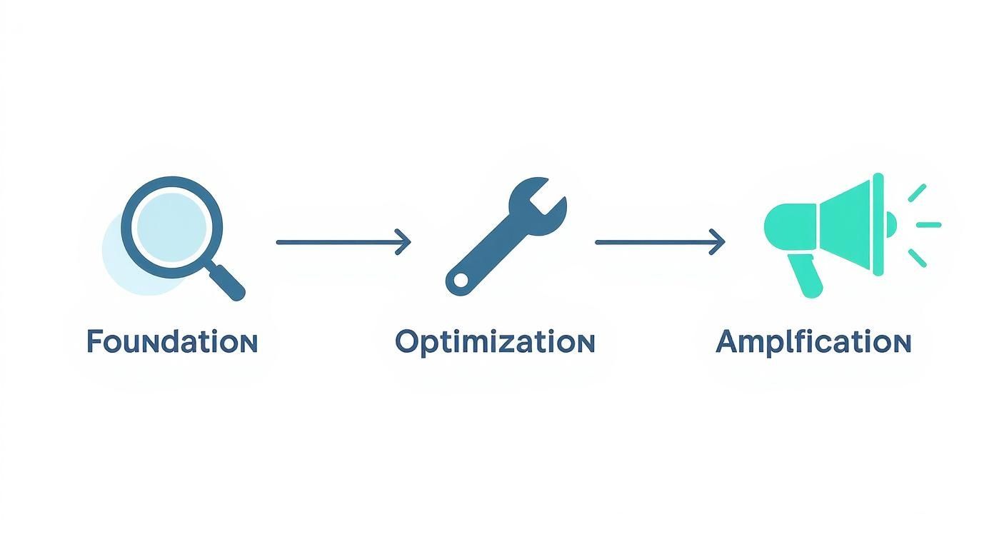
As you can see, successful optimization isn't about random tactics. It's a sequence where each step builds on the last, creating sustainable, long-term brand growth.
One of the first steps in the Foundation phase is establishing what a "good" conversion rate actually is for your business. It’s not a one-size-fits-all number. It can swing wildly depending on your industry, average order value, and traffic sources.
A common mistake is chasing a vanity metric without context. A 2% conversion rate might be excellent for a luxury furniture brand but concerning for a fast-fashion retailer. The key is to benchmark against your industry and, more importantly, against your own historical performance for continuous improvement.
For example, data for 2025 shows the global average ecommerce conversion rate hovers between 2% and 4%. However, industry variations are significant. Personal care often sees an average 6.8% conversion rate, while sectors like fashion and jewelry are closer to 1.9%. This context helps you set achievable goals and focus your efforts where they matter most.
Improving your conversion rate starts with asking the right questions. Instead of jumping to solutions ("Let's make the button green!"), a proper audit examines the entire customer experience. We analyze key performance indicators (KPIs) that tell a story about your brand's performance.
For a deeper look at how this fits into a bigger growth plan, check out our guide on 7 effective ecommerce growth strategies for retailers.
To help you get started, here's a quick reference table for the KPIs that truly matter and what they reveal about your store’s health.
| Metric | What It Measures | What It Reveals About Your Business |
|---|---|---|
| Overall Conversion Rate | The percentage of visitors who complete a purchase. | A high-level indicator of your store's overall effectiveness. |
| Add to Cart Rate | The percentage of visitors who add at least one item to their cart. | Shows if your product pages and pricing are compelling enough to create purchase intent. |
| Checkout Abandonment Rate | The percentage of users who start checkout but don't complete it. | High rates often point to friction like unexpected shipping costs or a complex form. |
| Bounce Rate | The percentage of visitors who leave after viewing only one page. | High bounce rates can signal poor ad targeting, slow page speed, or weak landing pages. |
| Average Order Value (AOV) | The average amount spent each time a customer places an order. | Helps you understand customer purchasing behavior and the effectiveness of upselling. |
| Revenue Per Visitor (RPV) | The average revenue generated for each visitor to your site. | A holistic metric combining AOV and conversion rate to measure overall profitability. |
By focusing on the why behind these numbers, you can move beyond quick fixes and build an efficient, customer-centric experience. And as you optimize, don't forget modern tools; the best chatbots for e-commerce can answer questions in real-time and guide users through the funnel, giving your conversion rates another powerful lift.
Your product detail page (PDP) is where a potential sale becomes a reality. This is the moment a shopper transitions from "just browsing" to pulling out their credit card. Think of it as the digital equivalent of picking an item off a shelf in a physical store. They're examining it, weighing the pros and cons, and deciding if it’s coming home with them. This is where you win or lose the sale.

Your category pages might get them in the door, but the product page is what closes the deal. Every element, from the hero image to the return policy, must work in harmony to build trust, answer questions, and make that "Add to Cart" button feel like the only logical next step.
Here’s a classic marketing truth: people don't buy drills; they buy holes. This is the core principle of turning dry product features into benefits that resonate with customers. A feature is what your product has. A benefit is what the customer gets.
For instance, a backpack's feature is "water-resistant nylon." The benefit? "Your laptop and books stay bone-dry, even in a downpour." That simple shift connects your product directly to a real-world problem your customer is trying to solve.
To do this effectively without overwhelming visitors, structure your descriptions for scannability:
This layered approach serves both the quick-glance shopper and the deep-dive researcher, giving each what they need to make an informed decision.
In ecommerce, your photos and videos have to do the heavy lifting of a physical experience. They must replace the ability to touch, feel, and try on an item. High-quality, multi-angle images aren't a luxury; they're non-negotiable.
A shopper can't hold your product, so your visuals must do the talking. Does it fit in their hand? What's the texture like up close? How does it look in a real-world setting? Your images need to answer these questions before they're even asked.
Don't stop at the standard white-background studio shot. Lifestyle images showing the product in action are critical for helping customers visualize it in their own lives. Better yet, a short video demo can be a conversion powerhouse, building confidence and eliminating last-minute hesitation.
Nothing sells a product quite like seeing other people loving it. Social proof is a powerful psychological principle where people follow the actions of others, assuming it's the right choice. On a PDP, this is your secret weapon for winning over skeptical new customers.
Integrate different types of social proof throughout the page:
This mix of peer approval and expert validation makes the decision to buy feel much safer and smarter. For brands selling across multiple platforms, mastering how this content is presented is a game-changer. You can get deeper insights in our guide to marketplace product listing optimization.
The call-to-action (CTA) button is the finish line. It should be big, bold, and impossible to ignore. But a great CTA isn't just about color. The microcopy—the small text around it—can be the difference between a click and an exit.
Use this prime real estate to eliminate any last-second doubts. Add small, reassuring text snippets right next to the button to reduce perceived risk and reinforce value. Think of messages like:
These small reassurances can be the final push a hesitant shopper needs to click "Add to Cart" with total confidence.
So you’ve nailed the product page. A customer is excited, they’ve clicked “Add to Cart,” and you’re seconds away from a sale. And then… they vanish.
This is the reality of the checkout process. It’s the final hurdle where a near-certain sale can fall apart in a few frustrating clicks. Think of it as the last hundred yards of a marathon; a clunky checkout is like throwing hurdles in front of an exhausted runner.

The numbers here are genuinely staggering. The average cart abandonment rate still hovers around 70.19%. Nearly three out of four shoppers who add your product to their cart leave without buying. With mobile making up roughly two-thirds of all ecommerce orders, an unoptimized checkout is a massive, costly leak in your revenue pipeline.
Two of the biggest conversion killers at checkout are unexpected costs and forced account creation. A customer has a price locked in their head. When they get to the final screen and see that total balloon with high shipping fees or taxes, it creates sticker shock and instantly breaks trust.
The other major point of friction? Forcing someone to create a password and fill out a profile just to hand you their money. It’s an unnecessary barrier.
The goal of your checkout is to make paying as easy as possible. Every extra field, every unexpected fee, and every mandatory step is another reason for a customer to second-guess their purchase and click away.
The fixes are straightforward but incredibly powerful:
When a customer pulls out their credit card, they're placing their trust in your brand. You have to reinforce that trust at this critical moment. Simple visual cues can make a huge difference in easing shopper anxiety.
Displaying universally recognized trust badges for secure payments (Visa, Mastercard, PayPal) and security seals (Norton, McAfee) isn't just decoration. It's a visual promise that their data is safe, which can be the final reassurance they need.
Beyond security, modern shoppers expect options. The days of only accepting traditional credit cards are long gone. A checkout built to convert needs to include:
Even with a flawless checkout, people get distracted. That’s where a solid cart recovery strategy comes into play. This isn't about spamming people; it’s about sending a timely, helpful reminder to shoppers who showed clear intent to buy.
To figure out why they’re leaving in the first place, you can use tools like cart abandonment survey templates to get direct feedback.
From there, a simple automated email or SMS sequence can bring a surprising number of those customers back to complete their purchase.
A basic but effective flow looks like this:
By plugging these common leaks, you’ll transform your checkout from a point of friction into a smooth, trustworthy final step that secures more revenue and builds lasting customer confidence.
For today's online shopper, a fast website isn't a perk—it's the bare minimum. Every second counts. In fact, just a one-second delay in page load time can reduce conversions by 7%. Slow sites don't just annoy people; they actively cost you money.
This is a critical part of the Optimization phase in our framework. Before you pour more money into driving traffic, you have to ensure the experience is seamless. We've laid the foundation, and now it's time to tune the engine for performance.

You can't fix what you can't measure, so improving your site speed starts with a clear diagnosis. A great place to start is with a free tool like Google PageSpeed Insights. It provides a performance score and, more importantly, a specific, actionable list of technical improvements.
The report will show you key metrics like First Contentful Paint (FCP) and Time to Interactive (TTI), giving you a clear picture of what the user is experiencing and where the friction is.
In our experience, most speed issues boil down to a few common culprits:
For a deeper look into the technical side, our guide on 10 ecommerce SEO best practices for measurable growth explains how site speed directly impacts your search rankings.
With well over 70% of retail traffic coming from smartphones, a "mobile-friendly" site no longer cuts it. You need a mobile-first strategy. That means designing the entire experience for the smallest screen first and then adapting it for desktop, not the other way around.
A responsive design just makes a desktop site fit on a phone. A true mobile-first experience is built from the ground up for the mobile user—thinking about their context, their distractions, and their need for speed and simplicity.
This is about much more than just aesthetics; it's about pure function and usability.
Here’s a quick comparison of what to prioritize for each experience.
| Optimization Area | Key Focus for Mobile | Key Focus for Desktop |
|---|---|---|
| Navigation | Thumb-friendly buttons, simple menus. | Rich mega-menus, clear top navigation. |
| Forms | Minimal fields, autofill enabled. | More detailed forms are acceptable. |
| Payments | One-click options (Shop Pay, Apple Pay). | Multiple payment options, trust seals. |
| Content | Scannable text, concise headlines. | In-depth descriptions, larger images. |
| CTAs | Large, sticky "Add to Cart" buttons. | Prominent, clear CTAs above the fold. |
Ultimately, a true mobile-first experience puts these elements front and center:
By focusing on both speed and the specific needs of mobile shoppers, you build a smooth path to purchase on any device. It's a powerful one-two punch for improving your conversion rates and capturing every sale, no matter how a customer chooses to shop.
Guessing what might boost your conversion rate is a recipe for wasted time and money. Real, sustainable growth comes from swapping assumptions for hard data. When you build a smart testing framework, you shift from “we think this will work” to “we know this works,” turning optimization into a repeatable process that builds on itself over time.
This isn’t about randomly testing button colors and hoping for the best. It's a structured approach that starts with a clear question and ends with a confident, data-backed decision. This is where the Optimization phase of our framework creates a continuous cycle of improvement.
Before you launch an experiment, you have to pick the right tool for the job. There are a few core methods, and each is designed to answer a different kind of question.
A/B Testing (or Split Testing): This is the most common and straightforward method. You create two versions of a page (‘A’ and ‘B’) with one key difference, like a new headline or hero image. Then you split your traffic between them and measure which one performs better. It's perfect for testing bold, singular changes.
Multivariate Testing (MVT): Think of this as A/B testing on steroids. Instead of testing just one change, MVT lets you test multiple changes on a single page at once. For example, you could test three different headlines and two different CTAs simultaneously. It’s powerful, but it requires a significant amount of traffic to get statistically significant results.
Split URL Testing: This method is ideal when you're testing a major redesign. Instead of tweaking an element on a page, you’re pitting two entirely different URLs against each other. It’s the best way to see how a completely new page layout stacks up against your current one.
Every successful test begins with a strong hypothesis—a clear, testable statement that predicts an outcome. A weak hypothesis sounds like, "Changing the CTA button color will increase conversions."
A strong hypothesis is specific: "Changing the CTA button from blue to orange will increase clicks by 15% because orange stands out more against our site’s color palette, creating better visual contrast." It articulates a clear cause and a measurable effect.
The strength of your test is directly tied to the quality of your hypothesis. It forces you to articulate why you believe a change will work, which is the foundation of learning and continuous improvement.
Once your hypothesis is solid, you need to prioritize. Not all tests are created equal. Changing a headline on your highest-traffic product page will almost always have a bigger impact than tweaking the footer on your contact page. Focus on high-traffic, high-impact pages first to get meaningful data faster.
Running the test is only half the battle. Knowing how to interpret the results is what actually drives growth. The most important concept here is statistical significance. This tells you whether your results are due to the changes you made or just random chance. A significance level of 95% is the industry standard, meaning you can be 95% confident that the outcome is reliable.
It's also crucial to have a realistic baseline. According to recent industry data, global ecommerce conversion rates hover around 1.9%. Well-optimized stores often hit 2.5% to 3%, with the top performers on platforms like Shopify Plus pushing past 4-5%. If your rates are stuck below 2%, that’s a clear signal of fixable issues in your user experience. To get a better sense of where you stand, you can review Shopify conversion rate benchmarks and find areas to improve.
By building this disciplined testing framework, you create a powerful engine for improving your conversion rates. Every test, whether a win or a loss, delivers a valuable insight that makes your next move smarter—pushing your brand forward one data-driven decision at a time.
When you're digging into CRO, a few questions always seem to pop up. We hear them from brands all the time, so let's clear the air with some straight answers.
Everyone wants to know the magic number, but the truth is, a "good" conversion rate is relative. As a general rule of thumb, anything between 2% and 4% is considered solid for most industries.
But that's just a benchmark. A high-end furniture store might be thrilled with 1%, while a popular cosmetics brand could be aiming for 5% or higher. The most important metric is your own performance over time—focus on continuous improvement, not just a universal average. And don't forget to segment by device. Mobile conversion rates are often half of what you see on desktop, so lumping them together will just skew your data.
You can see results almost immediately with the right fixes. Simple, high-impact changes—like fixing a broken checkout link or adding a guest checkout option—can boost conversions within days. These are the quick wins that build momentum.
For bigger strategic changes, like a full product page redesign, you'll need to run a proper A/B test until you reach statistical significance. This typically takes a few weeks, depending on your site's traffic volume. The key is to think of CRO as an ongoing process, not a one-and-done project.
The biggest mistake we see brands make is trying to optimize everything at once. Instead of redesigning the entire site, they should zero in on one high-impact area—like the mobile checkout—and get it right. A targeted approach always delivers measurable results faster.
Easily the most common mistake is neglecting the mobile experience. Many brands pour resources into creating a beautiful desktop site, forgetting that the majority of their traffic is likely browsing on a smartphone.
A clunky, slow, or confusing mobile site is the quickest way to kill sales. Always design with a mobile-first mindset.
At RedDog Group, we help brands turn these insights into a structured plan for omnichannel growth. If you're ready to stop guessing and start seeing real, measurable improvements in your conversion rates, let's build a strategy that drives your brand forward. Let’s Talk Growth.
Leave a comment: